Client: Morton’s Flour
Role: Brand Narratives, Packaging, Brand System, Campaign, Identity, Creative Lead, Art Direction, Motion

Project Info.
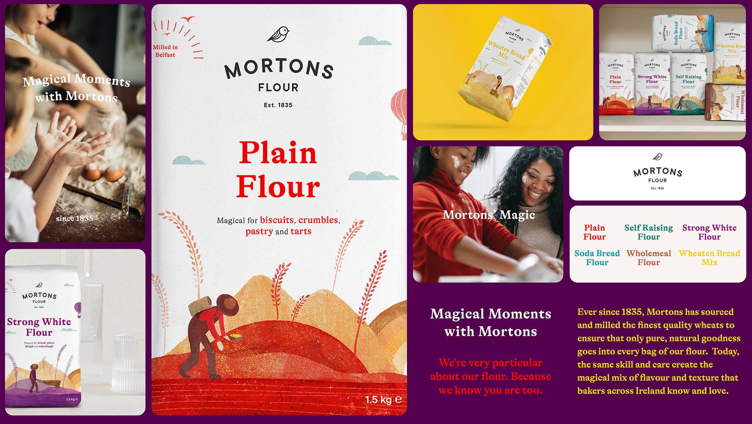
’Magical Moments with Mortons’ - Mortons Flour is the largest independent flour mill in Northern Ireland / IRE and one of the UK’s leading retail flour brands. The Mortons packaging rebrand was designed to fulfill three requirements. One: to elevate the brand's heritage and rich Irish history. Two: to create a seamless integration of story, packaging and product with today's contemporary consumer in mind. And three: to be 100% paper recyclable.
But to elevate their point of differentiation, a typographic and illustration system was developed to unify the brand’s range of products.
Project scope.
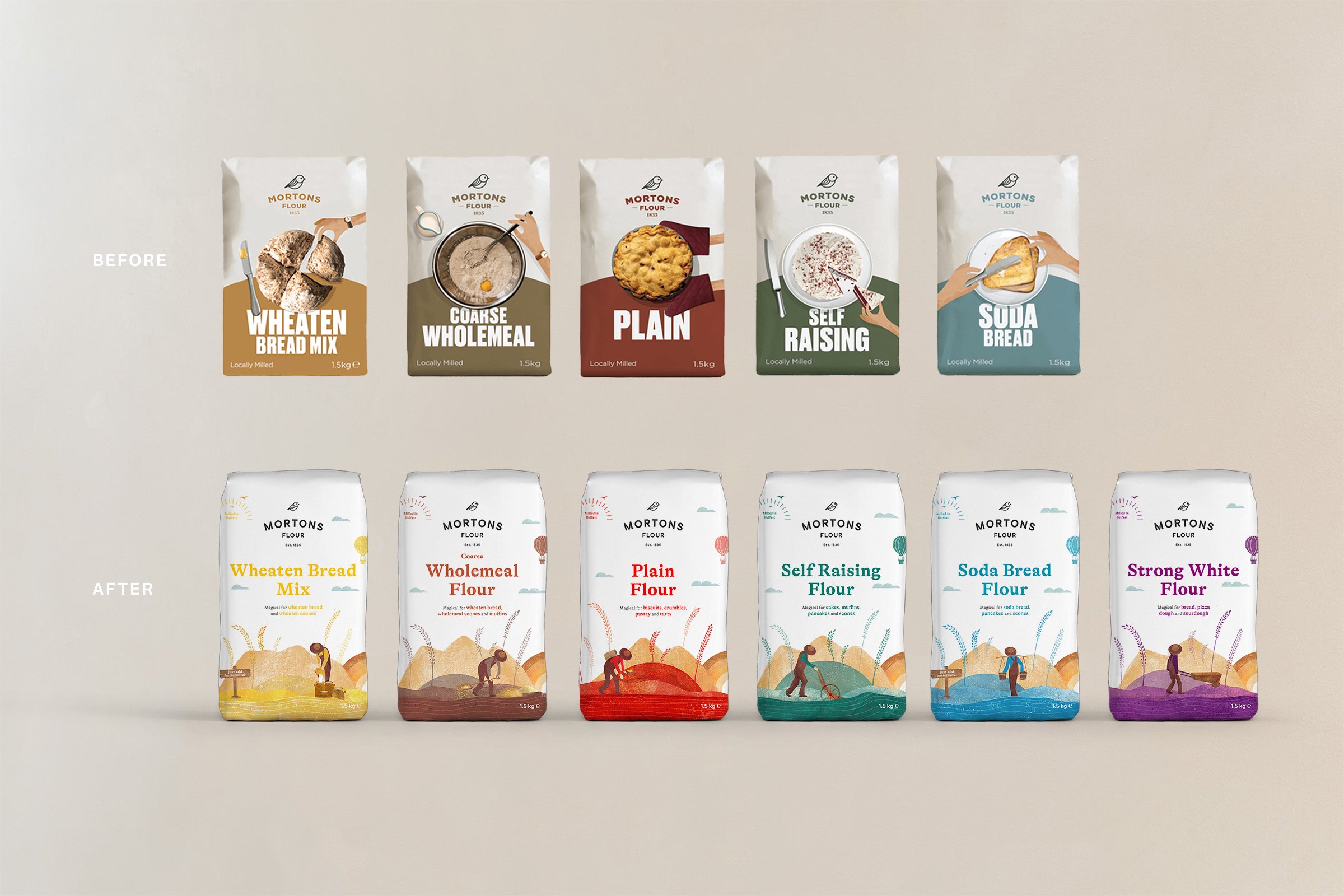
To refresh the existing brand in line with the ever-shifting demographic of home bakers, especially since Covid-19 is bringing a new, younger audience into the mix of consumer profiles and to champion the local homebaking traditions.
Brief.
To create a visual anchor that illustrates the brand's proposition of 'Mortons' Magic' through the product portfolio, showcasing how the products are 'magical' for a vivid range of recipes, since 1835..
Design Solution.
Mortons flour was divided into six colours, with each flour product communicating its uniqueness, and illustrating its complexity of range, quality and heritage via its sub-narrative and a structural packaging system respectively. To elevate their point of differentiation, a typographic and illustration system was developed to unify the brand’s wide range of products and overall communications..
Narratives.
The so-called 'Mortons' Magic' was created, and through the product portfolio, showcasing how the products are 'magical' for a vivid range of recipes (magic dust), since 1835.
Identity.
x.


