Client: Spotify
Role: Design Language, Creative Lead, Digital / Web, Motion, UI/UX

Project Info.
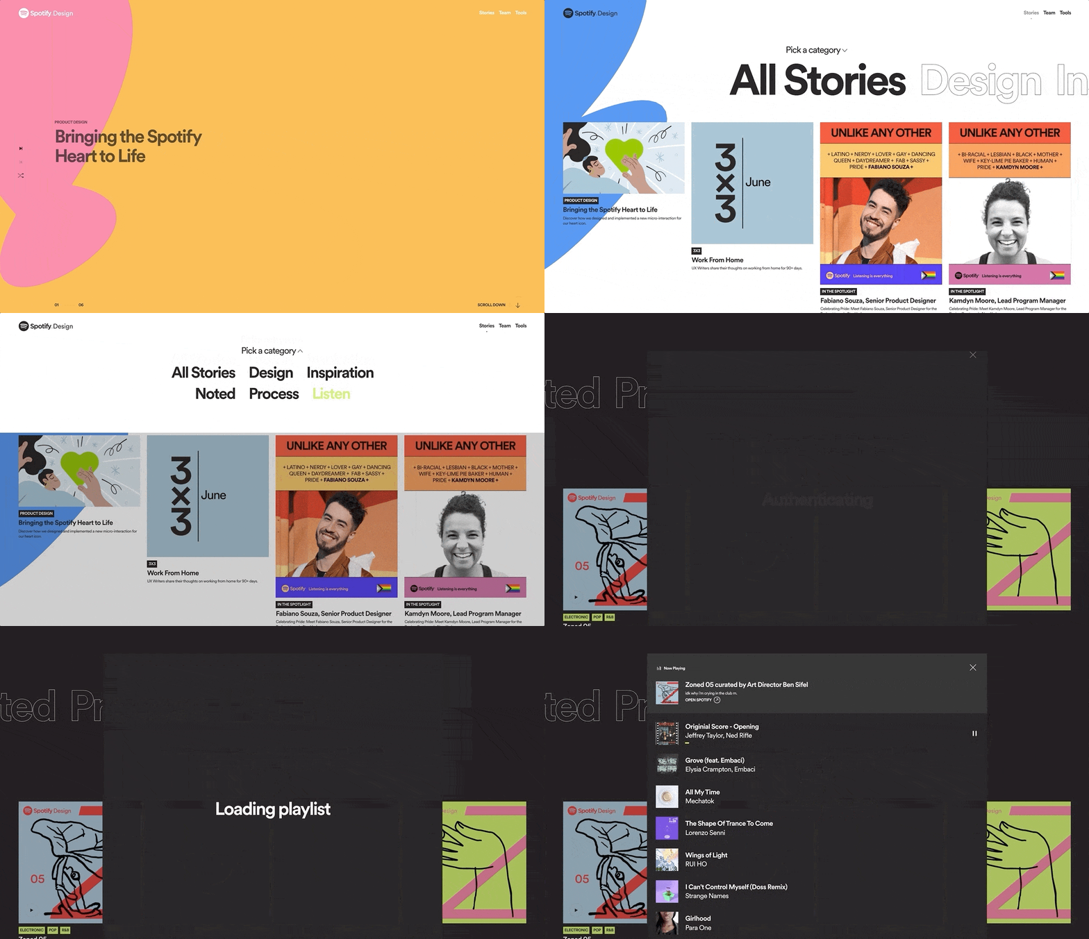
A collaborative project to level up the Spotify Design brand – and embracing color in the age of dark themes. Designers were pushing the Spotify Design brand system to the breaking point. Assets for presentations, social media, and in-person happenings were being created by different teams, and the interpretation of the design guidelines was a bit relaxed.
Scope.
The designers craved a more flexible, playful system that would allow them to tell stories, explore big ideas, and energize their respective community. The new brand was tackled using Spotify’s product design process — a.k.a. think it, build it, ship it, tweak it — to give it some structure and share the overall progress with designers in their own language.
More emotional mojo.
Before jumping into fix-it mode, we wanted to define the problem and figure out who’d help us solve it. Spotify wanted to bring some emotional mojo to one of their beloved editorial destinations, to create a brand that would be bolder — dare they say louder — that they would be proud to represent them. .
Identity.
Saturated with perspectives, viewpoints, and opinions, we started exploring - with keeping in mind the following brand attributes, as determined by Spotify’s team: ADAPTABLE, DIVERSE, QUALITY DRIVEN, WARM & FRIENDLY, HUMAN CENTERED. Bright hues quickly became a central theme in the discovery process. They wanted to stay away from the neutral, muted colors and with dark design themes so closely associated with Spotify, and aimed to deliver something more unexpected: bursts, action lines, and hand-drawn highlights.
The Spotify Heart.
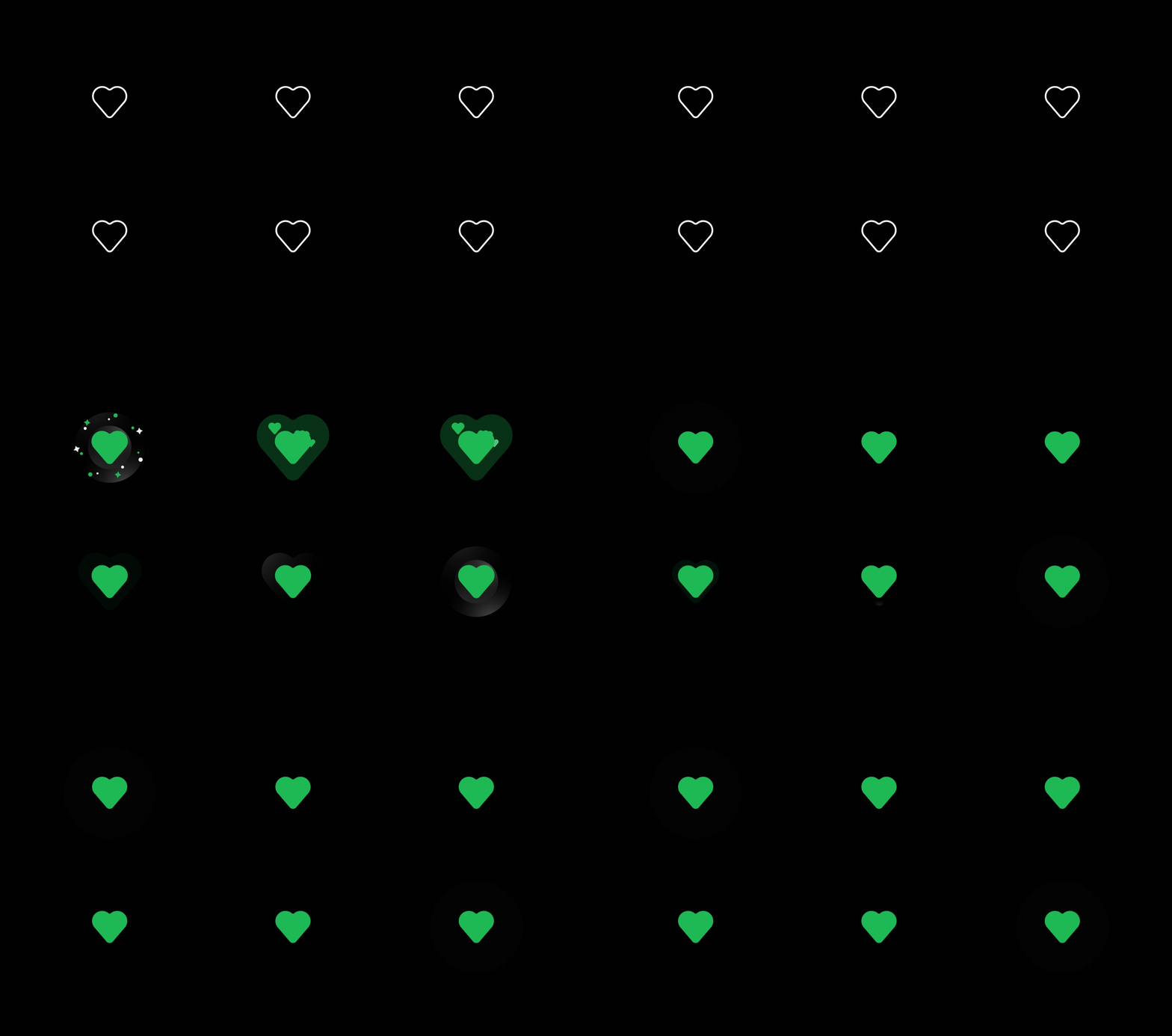
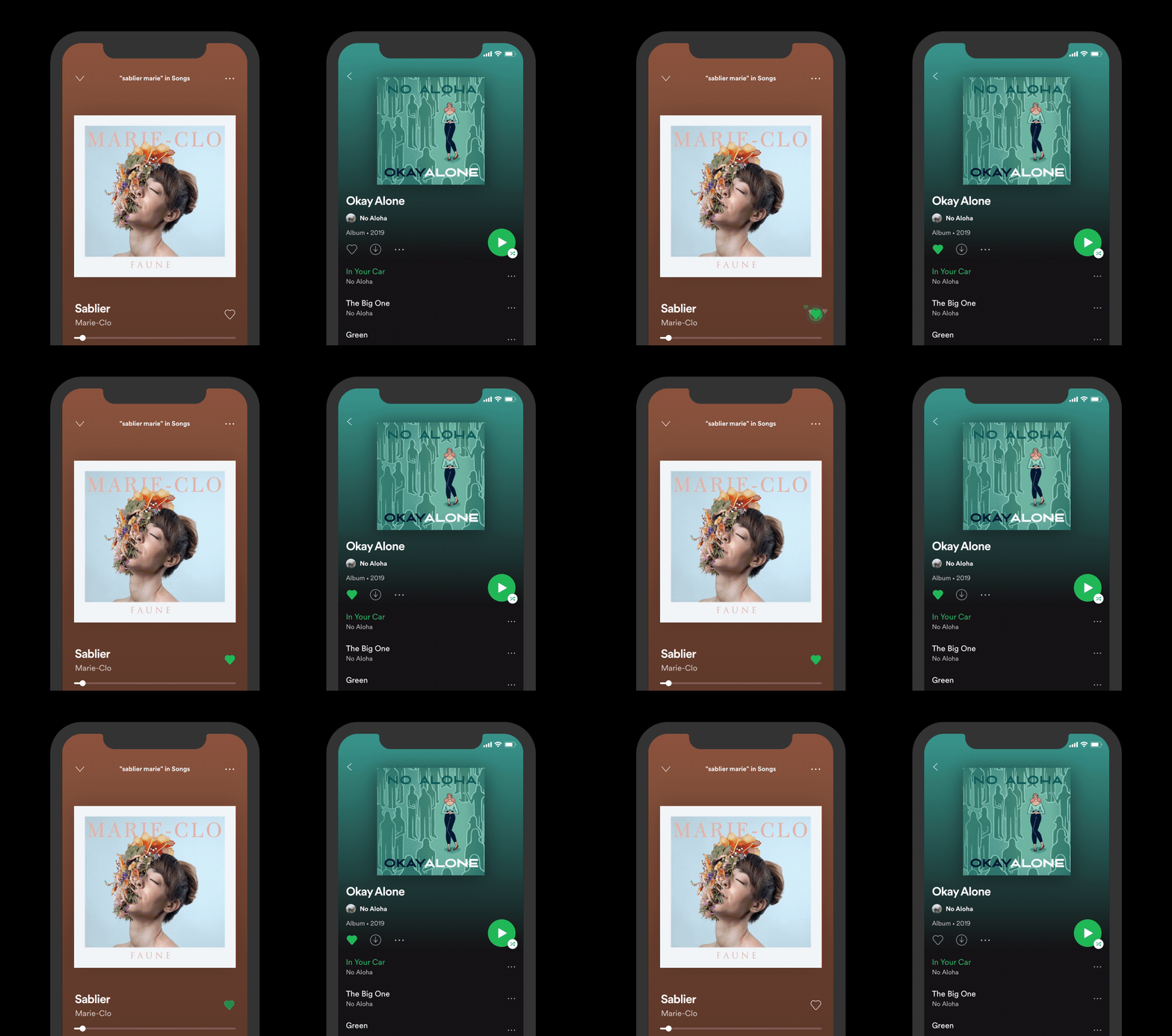
Motion at Spotify is nothing new, motion principles were already available in their design system, which helped massively in the ideation and exploration phase. It answered the big question — how to use motion to make Spotify experiences feel expressive, fluid, and easy to use. So we were tasked with redefining ‘like’ action. ‘Liking’ is how you tell Spotify that you’re into a particular song, album, or playlist. Finding music that moves and excites you is one of the best feelings in the world. However, the way their like button simply changed from a plain empty heart to a full heart didn’t convey that same feeling of excitement. And it needed to be changed.
Micro interaction.
The way we added motion to their products is inspired by the beat and rhythm of the music. It's characterized by pulses, flourishes, and the glow of light and color. We wanted to go even further and make the user actually “feel” the beat as they tap the like button. So we started exploring haptic feedback. We played with a variety of tools for designing custom haptic feedback but eventually opted to use iOS native feedback for better backward compatibility and simplicity.


