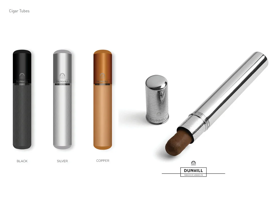
Client: Dunhill / Dunhill Reserve EMEA
Role: Concept, Art Direction, Lead Design Photo-shoot
Project Info.
New Logo, Identity, Skins and Packaging for Dunhill’s EMEA region.
With losing significant market share in 2016 and 2017, there was a need to relaunch Dunhill with a completely new visual style and identity. The recognisable core of the Dunhill box, the signature logo and Dunhill’s profile had to be maintained whilst evolving it into a more modern expression.
The Behaviour Challenge.
For Dunhill to become the co-conspirator in unapologetic little moments of pleasure.
The Pivotal Experience.
Introduce Dunhill as an ingredient, inspiring impulsive and elegant twists to smoking experiences.
What happened.
The re-branding activity delivered category growth of +4.3% YoY in Europe, the highest growth for Dunhill in a decade. With over 2,500 off-shelf displays, 50% higher than the objective, and an inspiring range of additional SKU launches, we delivered the best ever year of growth for the brand.


Scope.
The idea arose that taste can also be expressed with patterns, shapes and colors. Each cigarette was analyzed by a sensorist, and the result was converted into a distinctive pattern. Combining stronger branding and a newfound dedication to pushing the brand into new places where smokers might be found, the entire line is focusing on experiences rather than visuals whilst maintaining a trace of the stark simplicity that defined that classic packaging. My involvement was in the development and crafting of the visual language: gradients, bevels, seals, patterns, modern typography.


