Client: ALTIMA
Role: Brand Naming, Brand Narratives, Brand Strategy, Identity, Creative Lead / Direction, Digital / Web , UI/UX, Interior

Project Info.
To establish and manifest the top brand for all forms of rehabilitation inspiring confidence and quality without seeming price restrictive. To be instantaneously recognisable and associated with the must go place for rehabilitation.
Key Brand Purpose.
To reposition consumers expectations and understanding of rehabilitation and to make people aware for the first time what good quality rehabilitation can achieve, by making rehabilitation an every day norm as opposed to something you only consume when ‘broken’.

Narratives.
Altima functions as a straddle between a spa and a gym: practical, contemporary and purpose-built.
Identity.
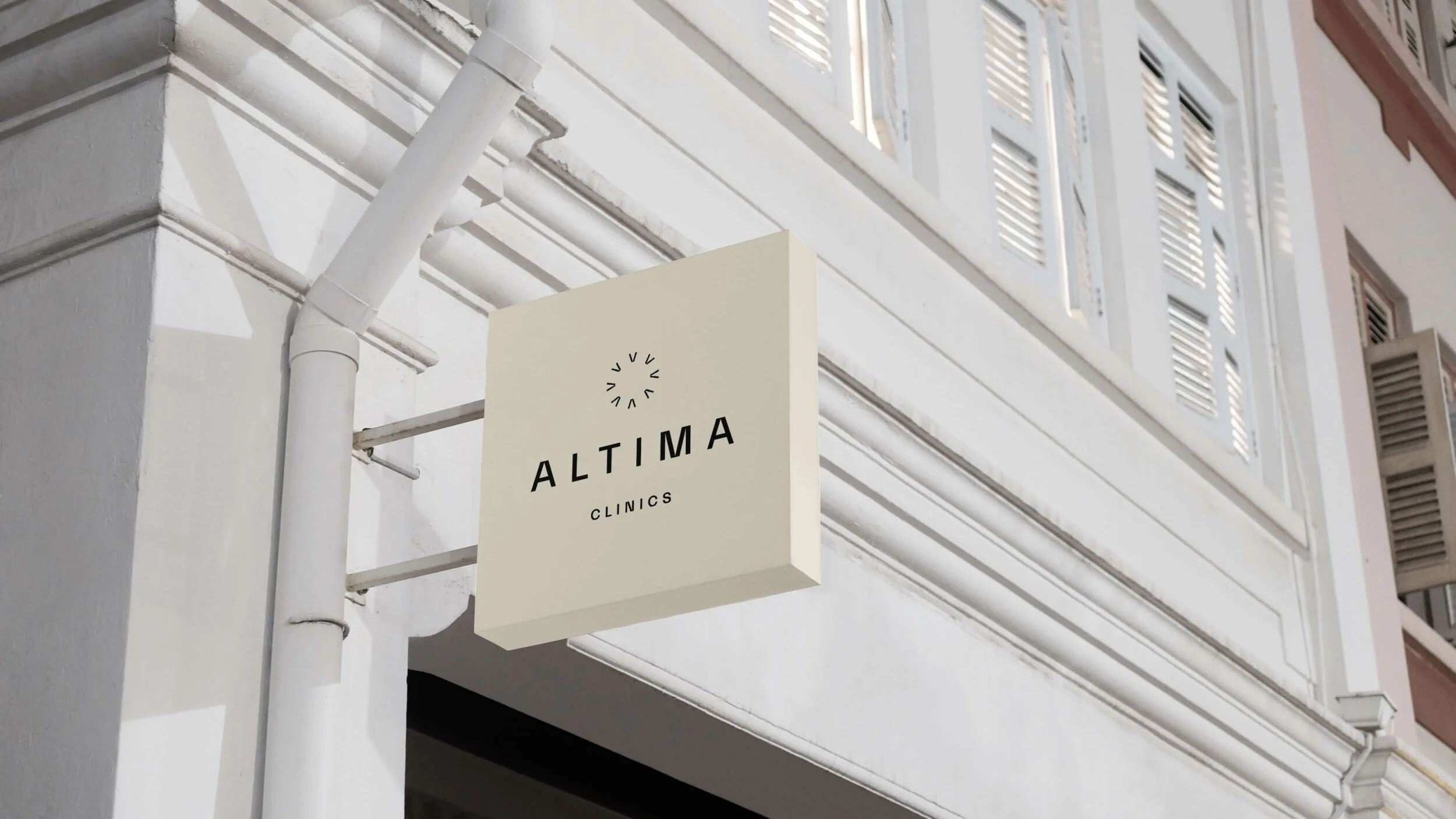
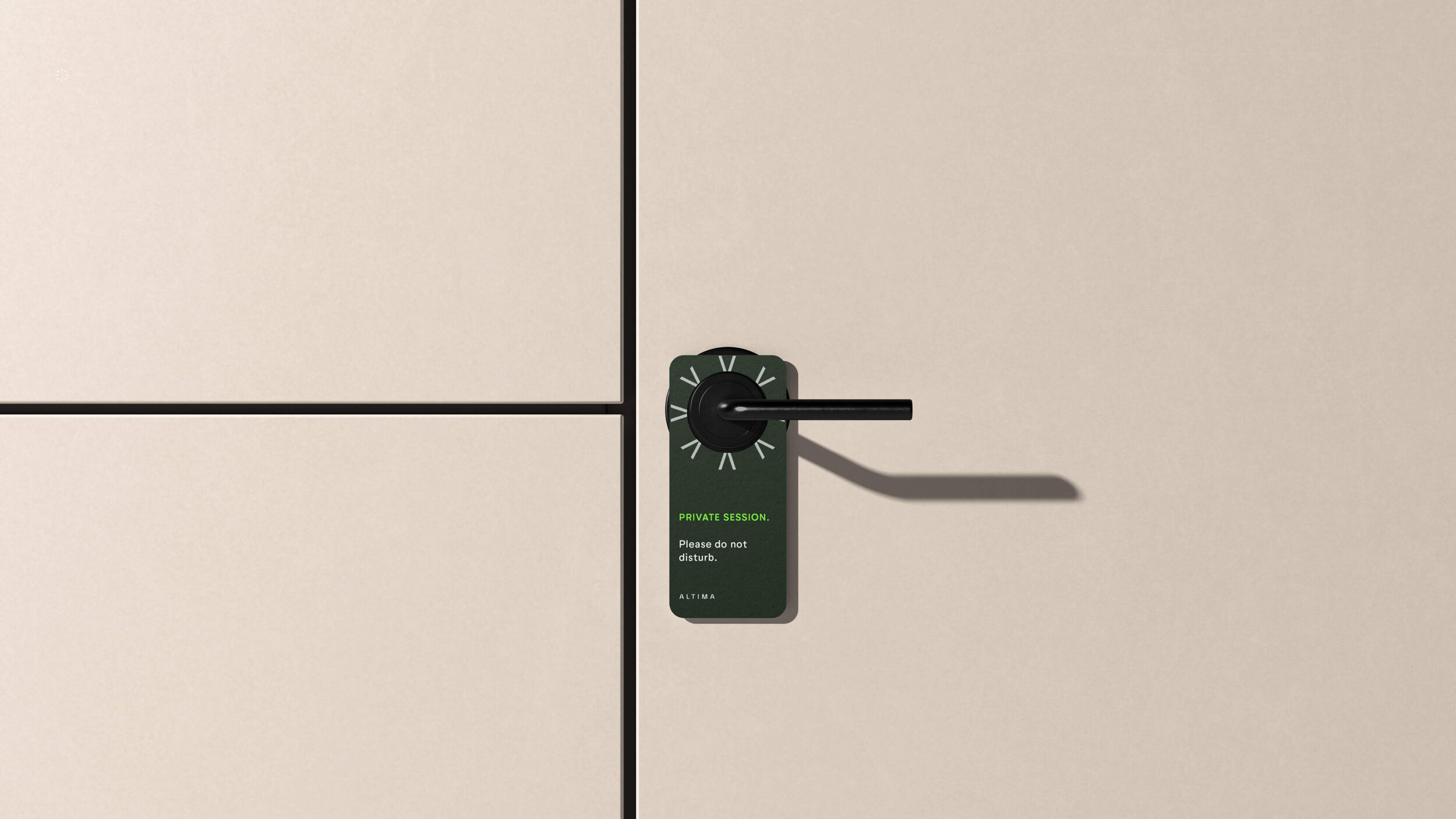
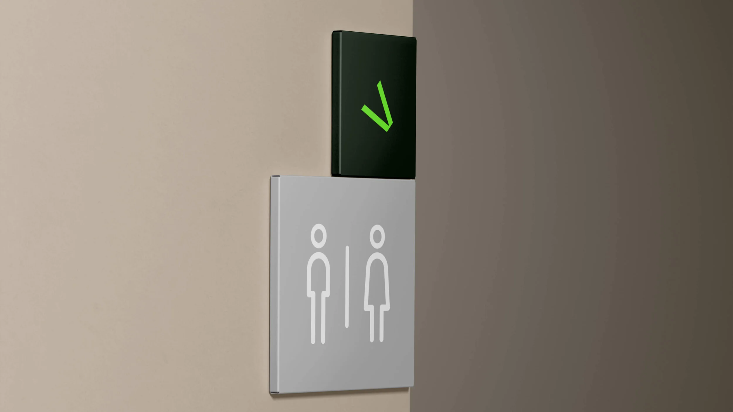
The visual cues are defined by the circle and the arrows - the circle represents 'the Self', notions of totality, wholeness, original perfection, the infinite, eternity and health, but mirrors Altima’s holistic offering, therapy and treatments: to be the ultimate self. The arrows symbolize reaching your goals and achieving your targets, while representing protection and defence, but works simultaneously as a distinct graphic motif; emerge by way of a converging arrow motif of A's.


